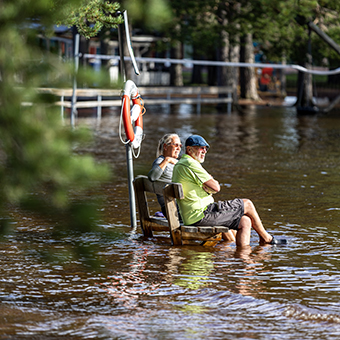
Följderna efter regnovädret Hans går inte att ta miste på. Vattennivån i Siljan och likaså i Orsasjön har höjts markant. Även om det inte är rekordnivåer enligt de personer jag har pratat med så är det fortfarande en vattennivå som ställer till det för fastighetsägare och föreningar som äger tex bryggor där det i dagsläget är svårt att bedöma värdet på de skador och det arbetet som kommer att komma efter att vattnet har dragit sig tillbaka.
På Leykauff Productions bestämde vi oss tidigt att vi ville dokumentera den höga vattennivån kring Orsasjön. Det har varit otroligt givande och roligt att prata med folk och höra deras åsikter och minnen om andra översvämningsår.
Design: Contrasting colors like yellow and blue grab the reader’s attention, in this case they also happen to be Tock’s brand colors. At the center of the email is a simple illustration of the city to highlight the hustle and bustle of the life surrounding restaurants. They decided to match the color of their button or designs to their brand’s colors, with the help of a contrasting background color for yellow and dark blue and yellow and white. Placement: Two CTAs are placed in the emailer: “Explore Tock” and “Learn more.” If someone’s ready to use Tock’s services, they’re more likely to press the first CTA.

If they’re still in the awareness stages of getting to know the brand, then they’ll most likely keep reading more on what Tock has to offer. They’re using one email design to speak to two types of readers both in the first stage of their welcome email.You can also change an email design’s color based on new product, season or to match a marketing campaign’s new look and feel.
Design: The email imitates a product marketing funnel system, bringing the reader towards each CTA with “Awareness, Consideration, and Action” as the main stages. Harry’s used a color block design to guide the reader through each step of the email. Color blocking helps to guide the reader through your copy, making it easy to read with a pleasing layout.
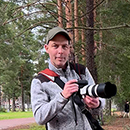
Älskar kreativ visuell kommunikation och dokumentation av verkligheten.